How to Create Responsive Tables in WordPress
Updated on Jun 30, 2023
Tables are a website design element that can help you display large amounts of information in an organized and elegant manner. They perform admirably on traditional computer displays but frequently produce an unpleasant experience on mobile devices.
Fortunately, there are several viable options for making tables more responsive. These responsive design practices can improve your site's User Experience (UX). Visitors can view and access the data in your tables more easily, regardless of their device.
This article will explain what it means to make a table responsive. Then we'll go over two methods for making responsive tables in WordPress. Let's get started!
This post includes:
What Are Responsive Tables?
A table's goal is typically to logically display a large amount of data. However, things can go wrong when viewing a table on a mobile device. That occurs because table rows are frequently many columns wider than your screen's display can accommodate.
When creating a responsive table, you make rules for your original data table. These rules can determine breakpoints based on the size of the display. If a user views the table on a device smaller than the breakpoint you set, the table will respond by reformatting it to fit the screen size.
Responsive tables can be reformatted by adding a scroll bar or stacking the data. If you shrink and cram the information in the cells to fit the screen size, the table will become unreadable. Fortunately, responsive design is relatively easy to implement.
How to Manually Make a Responsive Table
In WordPress, there are two methods for making a table responsive. First, we'll look at how to do the job without a plugin.
That will necessitate some coding knowledge, specifically knowledge of Cascading Style Sheets (CSS). We also advise working in a staging or development environment rather than on your live website until you have designed a table that works consistently.
Step 1: Format Your Table for Responsive CSS
In this example, we'll tell the data in our sample table to reformat at a specific breakpoint. In some cases, you can add a scroll bar to a table. Instead, we will group the table's data to appear in a more readable format that eliminates the need for horizontal scrolling. That is a great approach because horizontal scrolling frequently means viewing a column's data out of context.
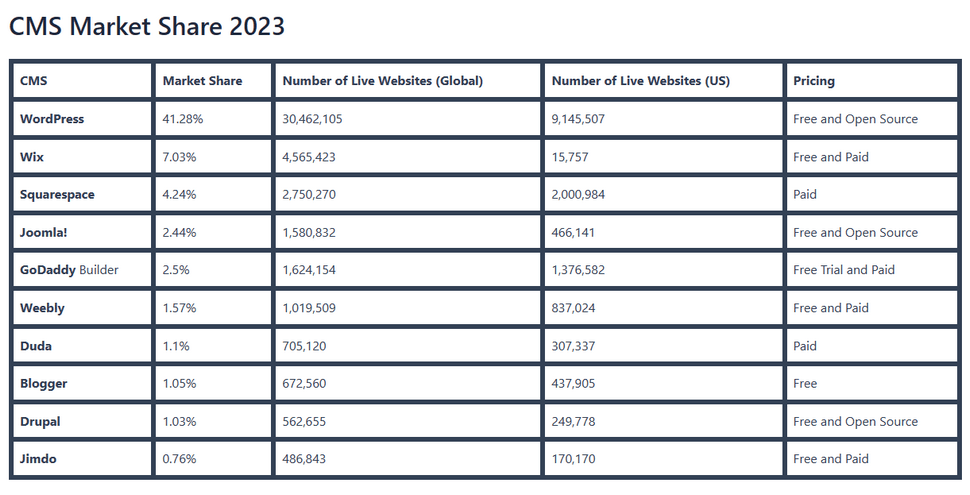
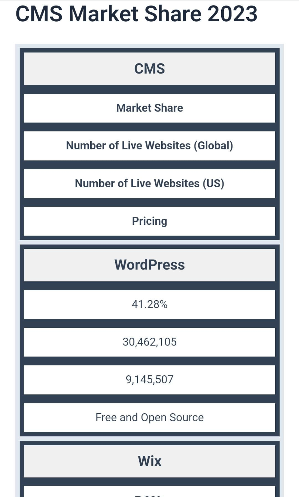
This is our example table and how it looks on desktop.
And this is how it looks on a mobile phone.
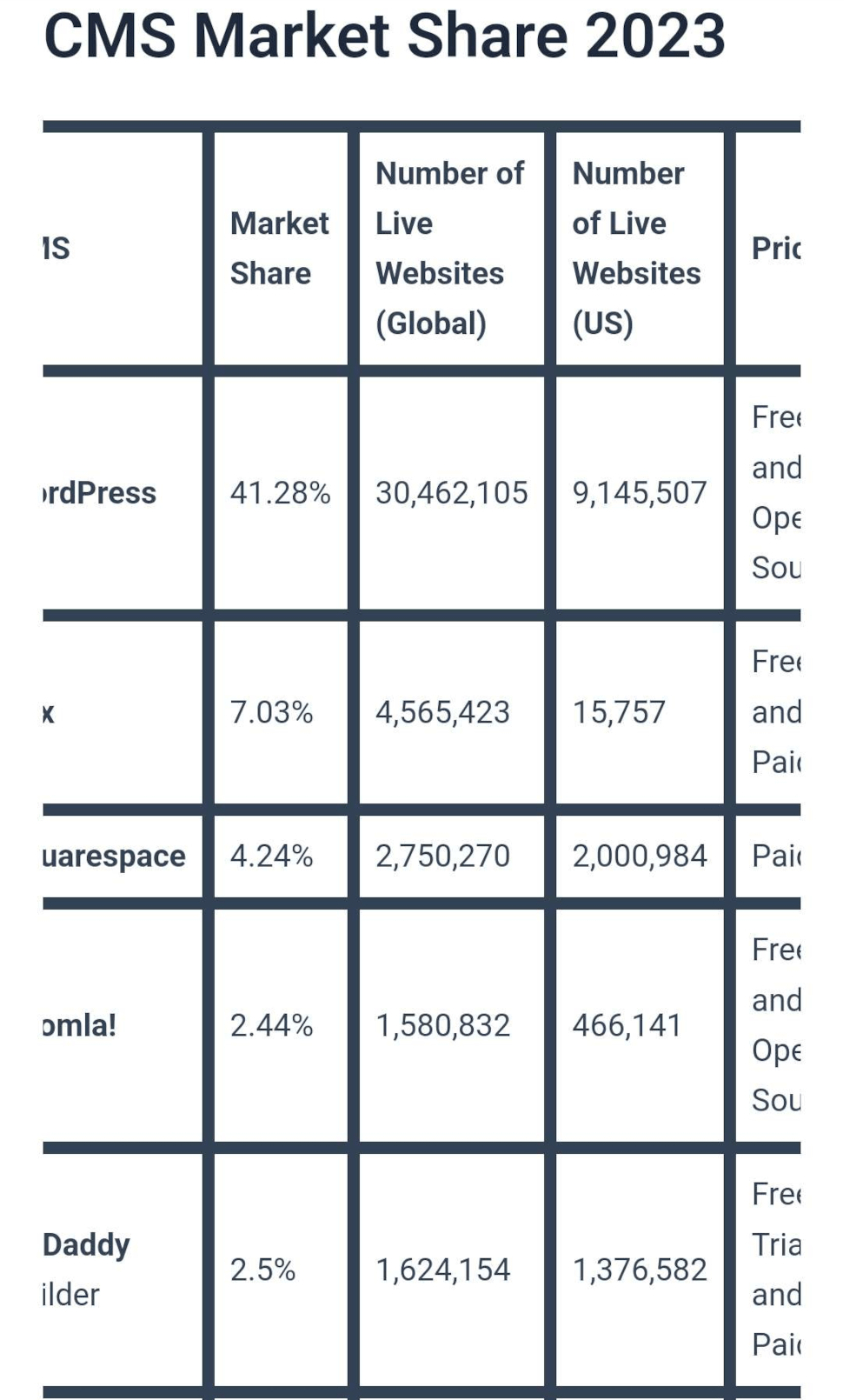
As you can see, we had to scroll from one end of the table to the other. To make this table work properly, you must first ensure that your table is properly formatted. If you're using the Block Editor to create a table, that was likely already handled for you. Open the code editor and ensure your table has <tbody> tags.
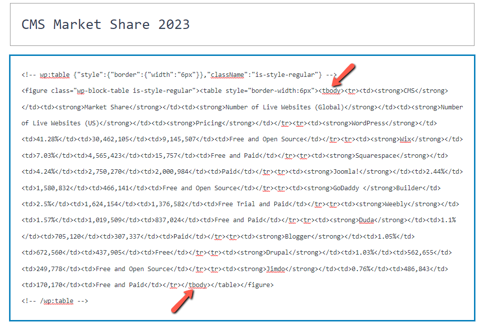
If it does not, add it and its closing tag to envelop the entire table, like in the example from above.
Step 2: Add a Custom Tag to Your CSS
Next, we'll use a snippet of custom CSS code to add to our theme. We are using Astra in this example, but you can use any theme, allowing additional CSS code to be inserted.
Because each theme is unique, you'll need to thoroughly understand the structure of your theme to implement a responsive table design successfully. Some themes may necessitate the use of an additional JavaScript library.
In our case, we'll go to Appearance → Customize → Additional CSS and enter the following custom CSS code:
@media screen and (max-width: 600px) {
  table {width:100%;}
  thead {display: none;}
  tr:nth-of-type(2n) {background-color: inherit;}
  tr td:first-child {background: #f0f0f0; font-weight:bold;font-size:1.3em;}
  tbody td {display: block;  text-align:center;}
  tbody td:before {
      content: attr(data-th);
      display: block;
      text-align:center;
  }
}
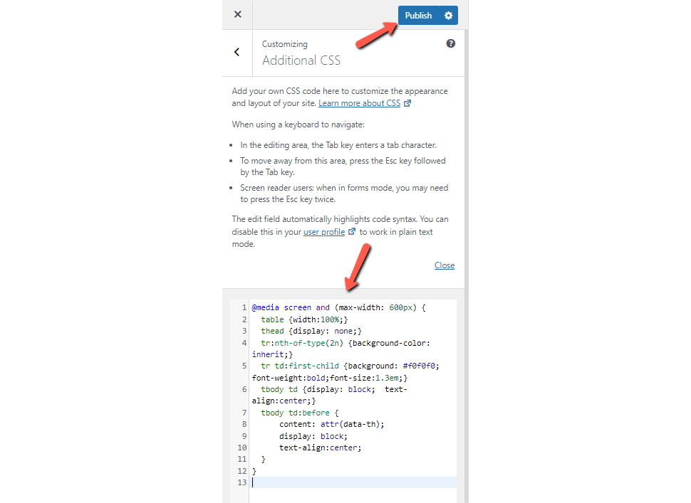
Once you paste your code into the editor, click Publish to save your changes.
Step 3: Test the Table's Responsiveness in WordPress
Finally, test your table. Open the page on your phone; it should look much more organized. The CSS we added reorganizes the data into a mobile-friendly format rather than adding a scrollbar or squishing the table's data. On a mobile device, the user can scroll vertically and view the table's data in context with the rest of the related cells.
As you can see, it is arranged in a much more readable manner.
How to Make a Responsive Table With a Plugin
There is another option if you are uncomfortable customizing your theme's code or CSS. There are several WordPress plugins available to assist you in creating a responsive table design for your website.
Step 1: Download a Plugin
To begin, you must first select a plugin. If you are uncertain how to find or install a plugin you can refer to our tutorial on the topic. Because there are numerous options for designing responsive tables, we'll highlight a couple to get you started:
- Ninja Tables: Labelled as WordPress' best plugin for creating responsive tables. It comes with numerous table styles.
- wpDataTables: This is a free plugin with a premium version. However, the Lite version has features for creating rich and interactive tables and charts.
For our example, we'll use Ninja Tables to demonstrate how to create a responsive table in WordPress.
Step 2: Input Your Data
After installing and activating the plugin, you can create a table immediately. You can add a table by going to NinjaTables → Tables → Create Your First Table. That will open the table creation window.
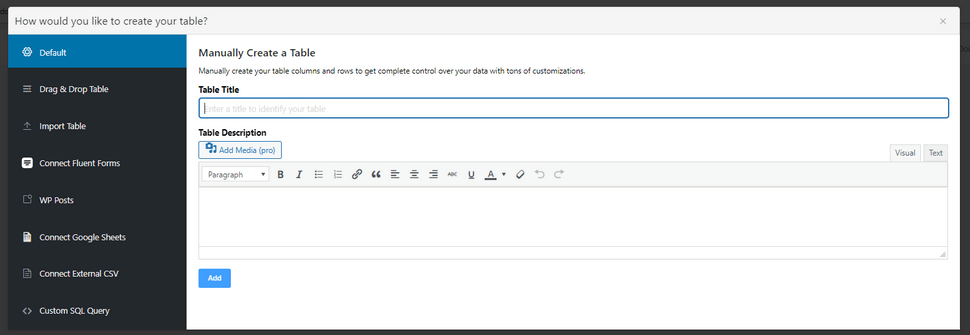
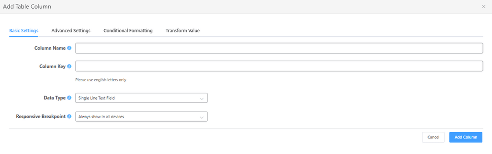
You'll then need to give your table a title and a description and click Add. Then start inputting data. You can select Add Column to set up your table's structure. You'll need to fill out a few fields to create your column. That includes the header name of the column as well as the type of data it contains. You'll also be able to configure its Responsive Breakpoint. It is best to leave it on Always show in all devices.
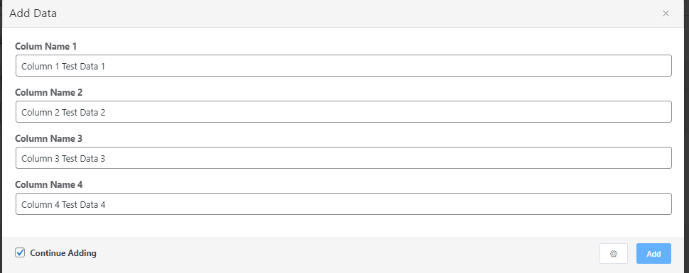
After creating your columns, click Add Data, and NinjaTables will display a simple form allowing you to add multiple entries to the table quickly. If you have multiple entries to make, leave the Continue Adding option selected. When finished, close the window and return to the table editing screen.
Step 3: Format Your Table
Now that you have a table with data, you can experiment with NinjaTable's settings and styling options. More settings are available from within your table editing window via the screen's top tabs and the right-hand side.
You can change the style and appearance of your table by alternating row colors, centering text, hiding data, and more.
Step 4: Test Your Table
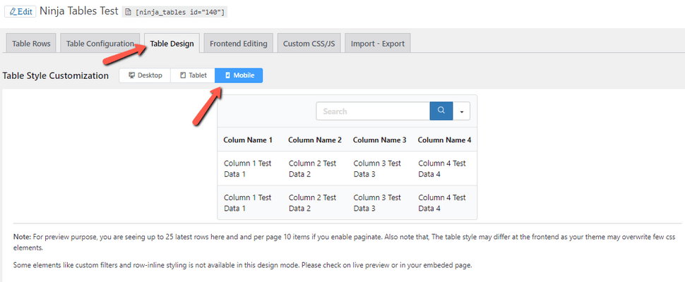
While editing your table, NinjaTable allows you to test its responsiveness. There are three options for testing screen responsiveness in the Table Design tab. To see how your table would look on different devices, choose Desktop, Tablet, or Mobile.
Each table you create also comes with a shortcode. Finally, to add the table you made to your page, use the NinjaTables block.

The table itself won't appear in the page editor but will show up when previewing the page.
Conclusion
When you have access to the right resources, creating a website with a solid responsive design doesn't have to be difficult. Our goal is for you to be able to provide your customers with the best digital experience possible.
We hope you find this article useful. Discover more about FastCloud - the top-rated Hosting Solutions for personal and small business websites in four consecutive years by the HostAdvice Community!

WordPress Hosting
- Free WordPress Installation
- 24/7 WordPress Support
- Free Domain Transfer
- Hack-free Protection
- Fast SSD Storage
- Free WordPress Transfer
- Free CloudFlare CDN
- Immediate Activation