How To Preview WordPress Sites On Mobile Devices
Updated on Jul 6, 2023
Whether designing sites for clients or managing your own WordPress website, it's critical to understand how it appears and functions on mobile devices before making any changes public.
You most likely have a mobile phone that you can use to check your site. However, returning to your phone is inconvenient if you're working on your laptop or desktop. Unfortunately, that is the most absolute way to test your website on a mobile device.
In this guide, we'll review a few quick ways to test your website for mobile without leaving your computer, which should provide a good guideline about how the website looks.
This post includes:
Why it is Important to Test Your Site for Mobile
Mobile devices passed desktop computers as the primary web browsing method a few years back. Mobile devices accounted for 65.49% of global web traffic by May 2023.
In response to growing mobile Internet use, Google has started penalizing sites that don't provide a good user experience. Several algorithm updates over the last few years have been designed to make the search experience better for mobile users. The 2015 "Mobilegeddon" update was the most drastic, as Google shifted to a mobile-first model.
Choosing a mobile responsive theme as a WordPress user is the first step in ensuring your site looks good and works well on mobile. That is especially important if you create new page layouts or add content to your site with a visual drag-and-drop page builder like Divi or Elementor.
Method 1: Use the Built-in WordPress Mobile Preview
You can always preview your WordPress posts and pages before publishing them. But did you know you can also see how your site will look on mobile? A mobile preview is available in two places in WordPress:
- From the post and page editor;
- From the WordPress customizer.
WordPress Post/Page Editor Preview
Let's start with a look at how the mobile preview works in the Post and Page editor. Next to the Publish or Update buttons, click the Preview button. Then, select Tablet or Mobile from the drop-down menu that appears.
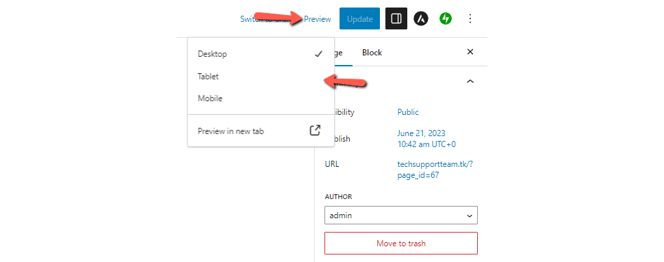
That will change the size of the page editor immediately. It is a good estimate of how the website will look. However, don't take it as an absolute, especially if you're using custom blocks or externally loaded CSS.
WordPress Customize Preview
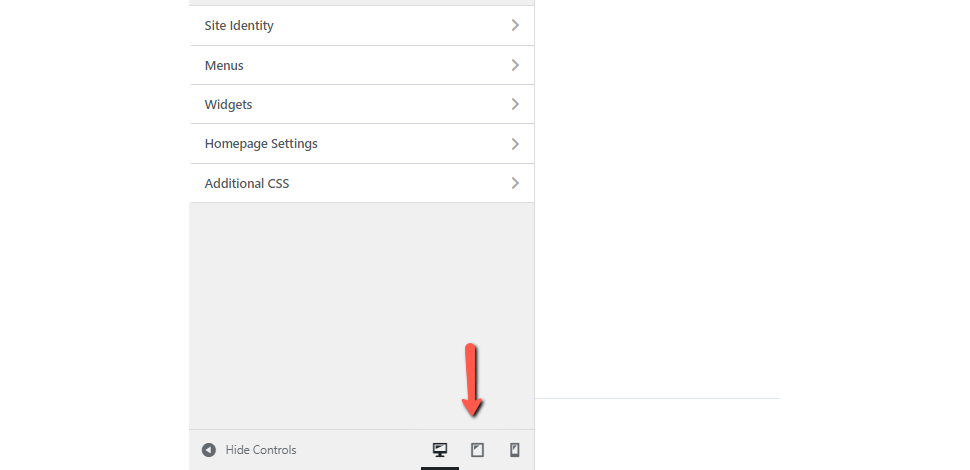
Firstly, we must preface the below instructions by saying that not all themes support the Customize option. If yours does, go to Appearance → Customize in your WordPress dashboard. There should be buttons for each type of device on the following page. We are using the Astra theme for our example, and the buttons are located at the bottom of the page.
Again, like the previous method, take this one with a grain of salt. It is a great guideline but not a concrete solution.
Method 2: Use Developer View in Chrome
Some browsers include device simulators. Chrome is one of the most popular browsers, and you can use it to see how your site looks on various devices and resolutions.
The Chrome device view is far superior to the WordPress mobile preview. You can switch between popular devices, see how your site looks when you zoom or rotate the screen, and even simulate a throttled mobile internet connection. This is a quick and easy way to test how your website looks and functions at different sizes, and it can alert you to any major issues.
Go to More Tools → Developer Tools in the Chrome menu.
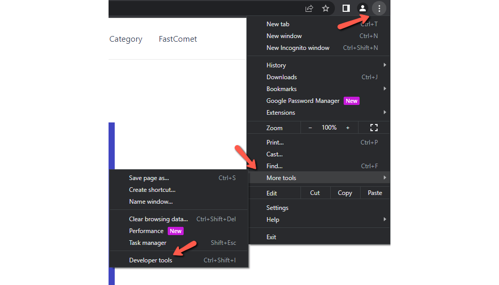
Then, click Toggle Device Toolbar.
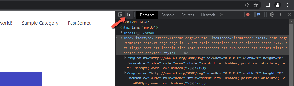
That will split the page in two, and on the left will be your website. You can adjust width, height, and rotation from a bar at the top of the page to preview various screen sizes. The bar also has presets for some of the more popular mobile devices. This method is another great guideline if you are looking for something outside the WordPress dashboard.
Method 3: Use a Browser Extension
Another good method is to use an extension for your browser, which will simulate how your website looks on a phone. We recommend Mobile simulator - responsive testing tool. Since it is an extension for your browser, it is quick and easy to install and provides a decent view of your website on a mobile device. This is how our website looks.

What is great about this extension is that it also allows you to interact with the browser and test its functionality further. The extension is available for Chrome, Edge, and Opera browsers.
Auditing and Testing Your Site to Make Sure it's Optimized for Mobile
Any of the methods listed above will allow you to see how your site appears on a mobile device. You should, however, run a few more tests to see if you can make any other improvements for mobile users.
The Google Mobile-Friendly Test
This simple online tool will allow you to enter any URL and determine whether or not it is mobile-friendly.
To use the tool, go to the page and type in the URL of the site or page you want to test. The test will conclude if your page is mobile-friendly, provide you with a screenshot of how it looks, and any tips or steps you need to take to improve it.
Google PageSpeed Insights
PageSpeed Insights is another free Google tool that will score your website of 100 based on how well it is optimized for speed. You can toggle between mobile and desktop (each will receive a score). The tool will provide you with a list of things you can do to speed up your site and an estimated time savings for each.
How to Make Your WordPress Site Mobile Friendly
If you use WordPress, you should be well on your way to having a mobile-friendly site. WordPress has included tools to ensure your site works well on mobile for years. Nonetheless, there are a few steps you can take to ensure your WordPress site provides a great mobile experience to users.
Use a Responsive WordPress Theme
If you're using a modern theme that's regularly updated, you should be fine. If you're using a theme that's a few years old, make sure it's built to be mobile-responsive.
If your website does not reformat itself to make it easier to read at a smaller size, ensure you're using the most recent version of WordPress core and your theme.
If updating does not solve the problem, consider switching to a more modern, mobile-friendly WordPress theme.
Make Sure Your Plugins Are Responsive Too
Most plugins do not affect how your site looks on mobile. However, if they add any visual elements to your site, you must ensure they function properly on small screen sizes.
Again, modern plugins should be designed to work equally well on mobile devices as on high-resolution displays. However, it is something you should definitely check before launching your site.
Functionality is essential for plugins. For instance, if they add a form or widget to your site, make sure it's simple to use and navigate on mobile.
Disable Pop-ups on Mobile Devices
Pop-ups can be annoying for desktop or laptop users, and they can render your site completely unusable for mobile users.
Rather than triggering a full-screen pop-up, disabling them entirely for mobile users is best.
Google has begun penalizing websites with intrusive pop-ups that obscure the underlying content. As a result, it is best to avoid them entirely. Alternatively, use a banner that takes up very little screen space.
Final Thoughts
Using any of these methods, you can test how your WordPress site looks on mobile. Still, we suggest using the results as a guideline rather than concrete evidence. Before launching a new site or making major changes, test it on at least one real mobile device.
Simply ensure that you can navigate around the site (pay attention to buttons and touchable areas), that all menus display correctly, and that any forms or interactive widgets work properly.
You can then launch your site knowing you've done everything possible to ensure a great user experience for desktop and mobile users.
We hope you find this article useful. Discover more about FastCloud - the top-rated Hosting Solutions for personal and small business websites in four consecutive years by the HostAdvice Community!

WordPress Hosting
- Free WordPress Installation
- 24/7 WordPress Support
- Free Domain Transfer
- Hack-free Protection
- Fast SSD Storage
- Free WordPress Transfer
- Free CloudFlare CDN
- Immediate Activation